Mission-Ready
by Design
The Electromagnetic Battle Management program enhances DoD spectrum visualization and control. This case study highlights the UX redesign that streamlined workflows, improved usability, and created a scalable interface for mission decision-making.
Project Overview
Challenge
When I joined the project in 2023, the product required constant feature additions, but the legacy design lacked a framework to support them. After several months of work, it became clear that the underlying issues were significant enough to warrant a full system redesign.
Information Architecture
To build the information architecture, we first audited the legacy system to identify redundancies and pain points. Using SME feedback, card sorting, and tree testing, we reorganized menus to reflect real user priorities instead of legacy constraints. We grouped related tools, clarified labels, and defined a scalable hierarchy across major sections.
After prototyping the structure, we validated it through usability testing and incorporated feedback into multiple iterations. This ensured the architecture improved discoverability, reduced clicks, and could expand as new features were added.

Navigation
Top Menus
The legacy menus relied on conflicting patterns, making navigation inconsistent and unpredictable. We redesigned them with a unified structure, clear groupings, and scalable patterns to create a more intuitive and reliable experience.

Left Rail
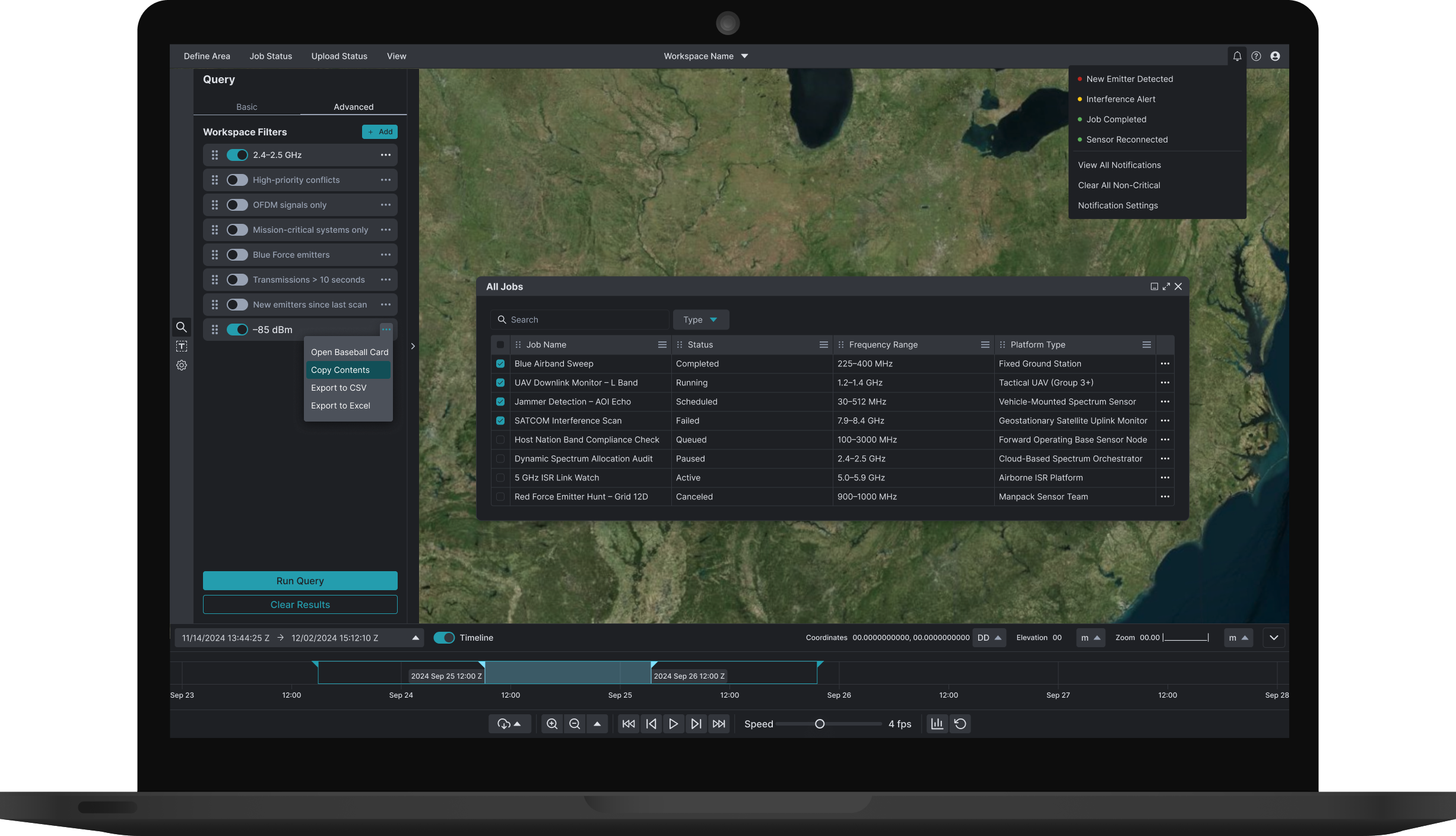
The new rail enabled users to view data objects by type, affiliation, domain, and band, while also providing a centralized panel for managing custom filters—making navigation more efficient and intuitive.

Timeline
During user testing, participants consistently identified the timeline as one of the hardest components to use. The legacy design required excessive scrolling, offered limited zoom and filtering, and made event sequencing unclear.
We analyzed feedback across sessions and found three recurring issues: lack of clarity, inefficient interaction, and limited functionality. In response, we redesigned the timeline with intuitive controls, clearer labeling, scalable zoom, and new filtering and alignment features.
Follow-up testing showed the improvements reduced friction and helped users interpret events more quickly and accurately.

Content Modules
Baseball Cards
Working with SMEs and data scientists, we prioritized key information and redesigned the cards with a compact view for quick reference and labeled accordions for deeper details. This improved clarity, usability, and efficiency.

Context Menus
The existing context menu created friction by spreading core actions across several menus and requiring unnecessary clicks to view essential information.
Our solution improved usability by adding pagination, labeled accordions, threshold-based messaging, and search functionality.

Notification Manager
We designed and implemented a notification manager that enabled users to easily view, filter, and manage system alerts. Instead of scattered or hard-to-track updates, users now had a centralized hub for notifications, giving them greater control and visibility.
By surfacing critical alerts alongside contextual details, the feature provided users with deeper situational awareness, helping them quickly identify issues, prioritize responses, and maintain operational readiness.


Impact
The EMBM-J-SA redesign improved operator efficiency by standardizing workflows, reducing cognitive load, and prioritizing mission-critical data. New features like customizable dashboards, labeled accordions, and AI-driven insights provided faster access to information and more flexible planning, laying a strong foundation for future spectrum management tools.
Ready to learn more about this project?
Explore the full case study for an in-depth look at our approach to redesigning EMBM while adding new features to the legacy system.