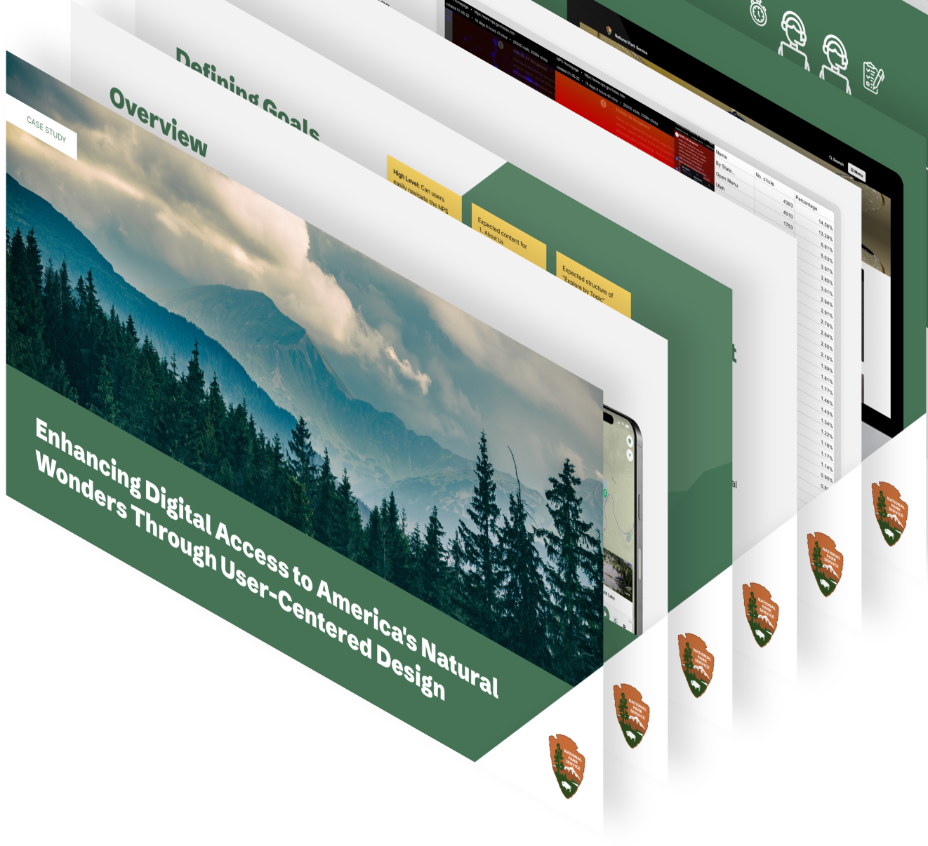
Improving Digital Access to America's Natural Wonders
A UX case study exploring how thoughtful design and research can make it easier for visitors to discover, plan, and experience America’s national parks.

Project Overview
Defining Goals
and Objectives
An initial stakeholder meeting was conducted to gather requirements, understand organizational objectives, and collect feedback to develop comprehensive test plans.

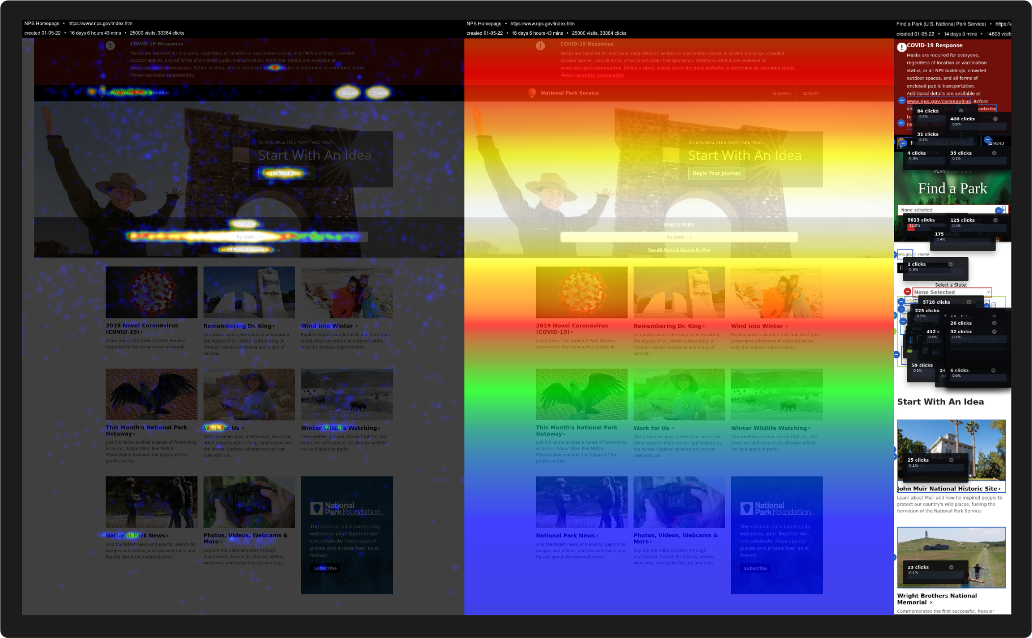
Heatmaps
Through analyzing CrazyEgg heatmap data from NPS.gov, we identified high-traffic sections and user interaction patterns on the homepage. This data visualization tool revealed both popular content areas and underutilized sections, helping inform our recommendations.
Defining Milestones & Deliverables
To ensure a systematic and thorough evaluation of the NPS digital platforms, our research study was structured with clear milestones and deliverables. This approach allowed us to maintain consistent progress while gathering comprehensive insights at each stage of the project.
The research process was divided into distinct phases, each with specific objectives and outcomes designed to build upon previous findings and inform subsequent steps.

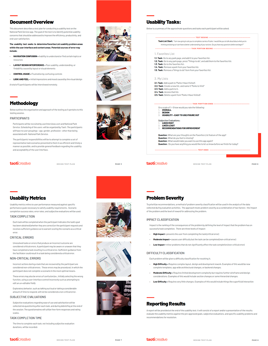
Test Plan Creation
Through collaborative sessions with NPS stakeholders, we identified key research objectives and metrics to maximize the value of user interviews. This information was used to create 3 test plans.
With a robust testing framework in place, we proceeded to the comprehensive user testing phase, ensuring alignment with both organizational goals and user needs.
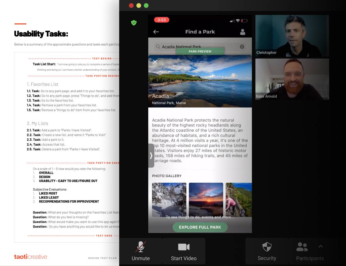
User Interviews

Our research methodology involved conducting in-depth, one-hour virtual interviews with 4-5 carefully selected participants.
Each session was structured as a 1:1 moderated conversation, with one primary facilitator leading the discussion and one dedicated observer taking detailed notes.
To ensure comprehensive coverage across different user experiences, we included participants who primarily accessed the website via desktop computers as well as those who mainly used mobile devices.
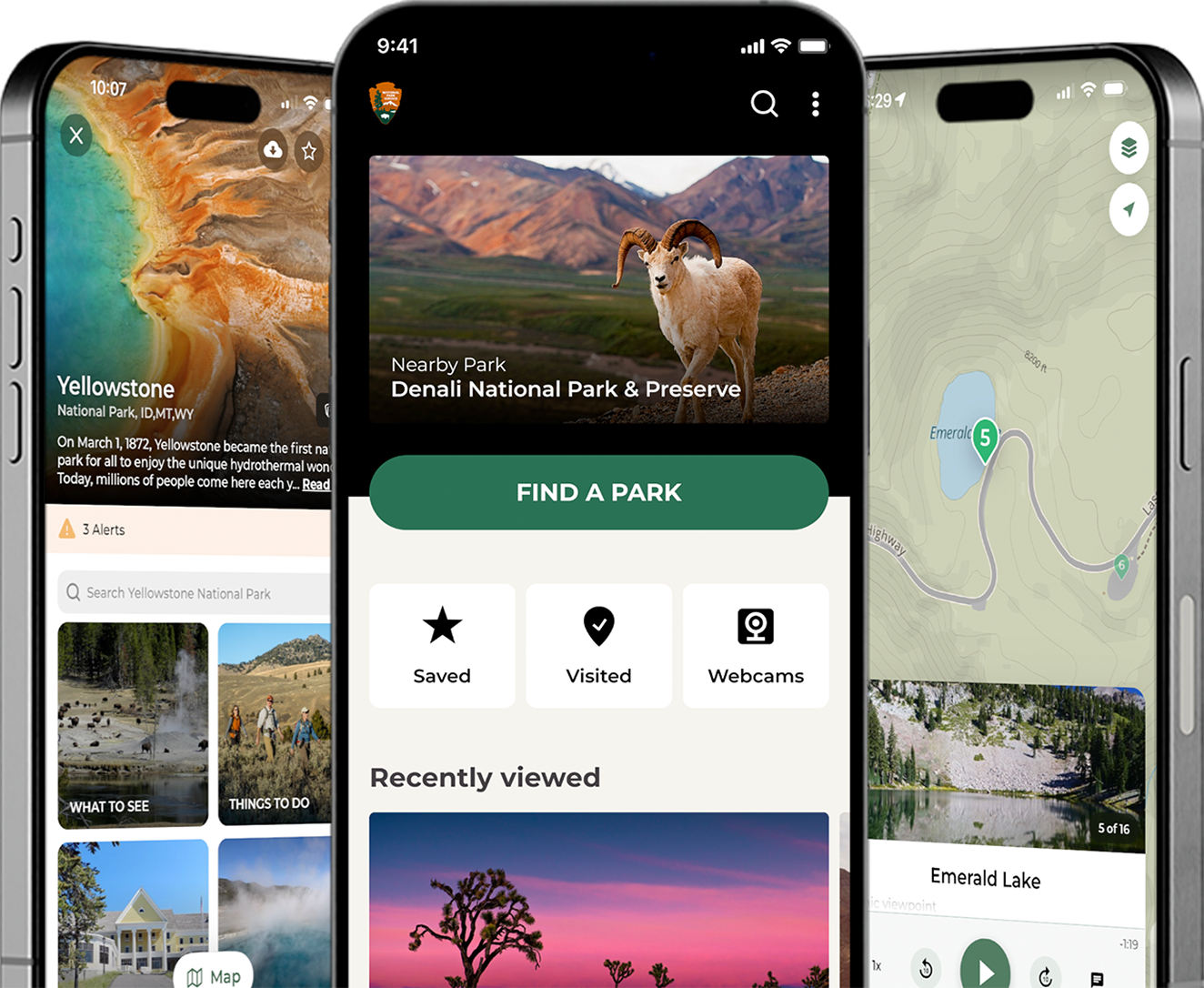
Learn and Explore
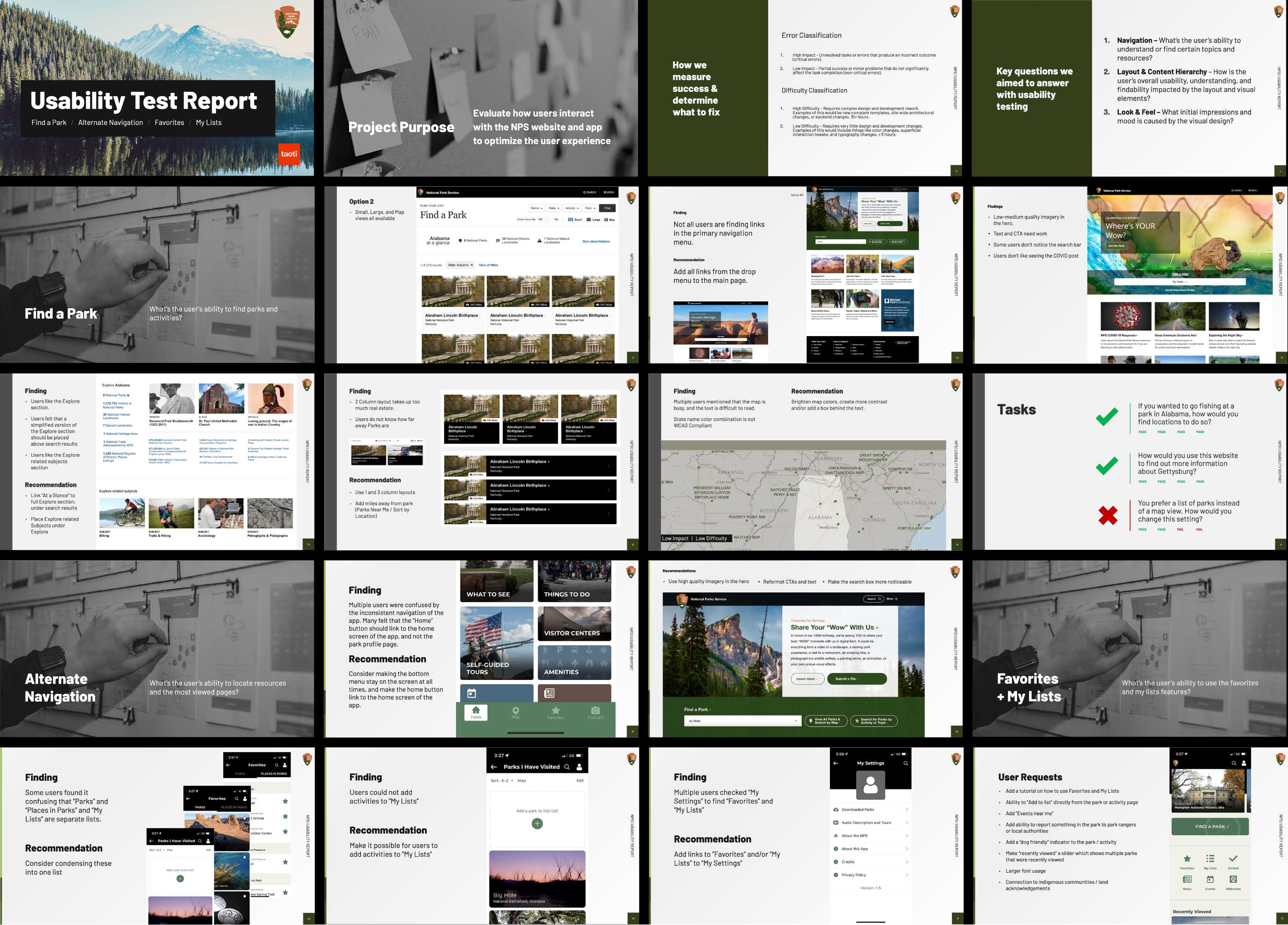
Research Results
Through our usability testing, we identified several critical tasks that users consistently struggled to complete.
These challenges provided invaluable insights into specific areas where the website's interface and navigation could be enhanced to better serve user needs.
The observed difficulties highlighted opportunities for improving user flow, simplifying complex processes, and creating more intuitive pathways to essential information.


While quantitative metrics revealed specific areas for improvement in task completion rates, qualitative feedback demonstrated strong user satisfaction with the overall website design and functionality.
Users consistently praised the site's visual appeal, wealth of information, and educational value, even when encountering occasional navigation challenges.

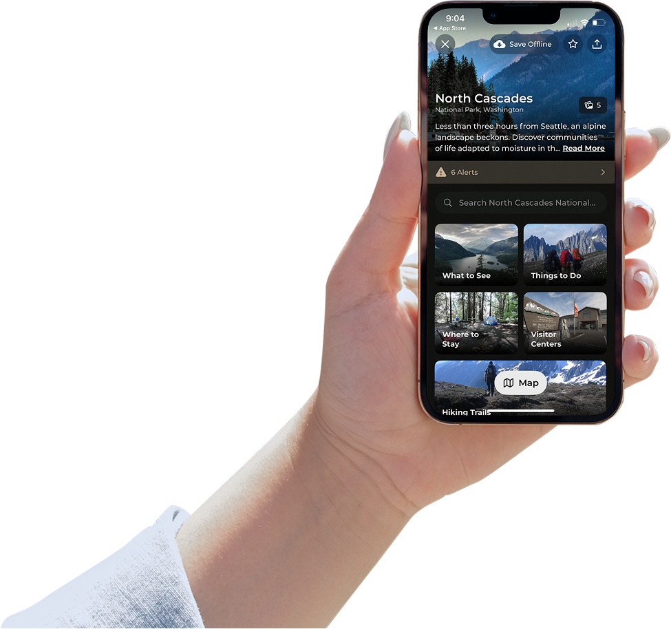
Find a Park
Research Results
Through a series of in-depth, hour-long interviews with five diverse users, we gathered comprehensive feedback on the feature's functionality and user experience.
The insights were carefully analyzed and consolidated into actionable findings and recommendations, which were presented to key stakeholders for implementation consideration.


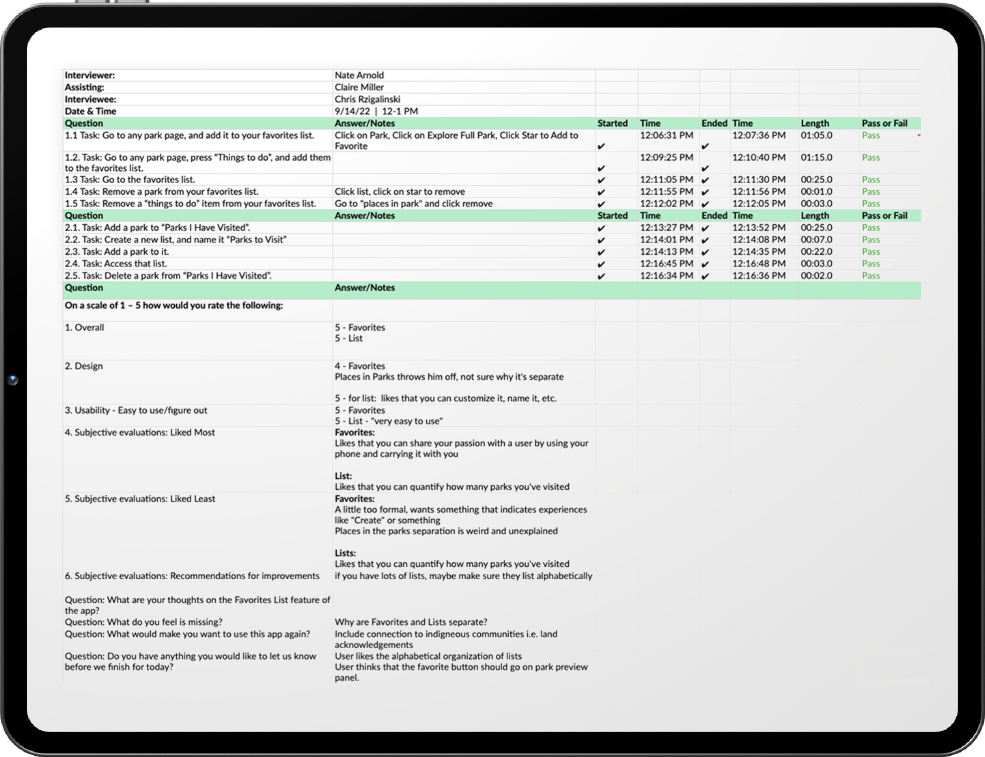
Favorites List
Following established testing protocols, we conducted in-depth user interviews with 4 participants to evaluate the application’s usability and gather feedback on the proposed changes.
During testing, we documented and analyzed the following key metrics:
- Task completion rate and success metrics
- Time-to-completion for each assigned task
- Pain points and usability obstacles encountered
- Qualitative feedback and user suggestions
- User behavioral patterns and navigation preferences
Deliverables
- A comprehensive 40-page detailed research report documenting findings, analysis, and recommendations.
- Interactive presentation session with stakeholders via Zoom, including Q&A and discussion of key insights.
- Executive summary highlighting critical findings and actionable next steps.
"This is a useful treasure trove of information for us to go through as a team and figure out what we can do, when we can do it, and what order we can do it."
Impact
Based on website analytics and user engagement metrics shared through professional networks, the NPS digital platforms demonstrate strong user satisfaction levels. The significant user base and consistent engagement rates suggest that the NPS website and applications effectively meet visitor needs for information and functionality.
Ready to learn more about this project?
Explore the full case study for an in-depth look at our approach to improving NPS user experiences.