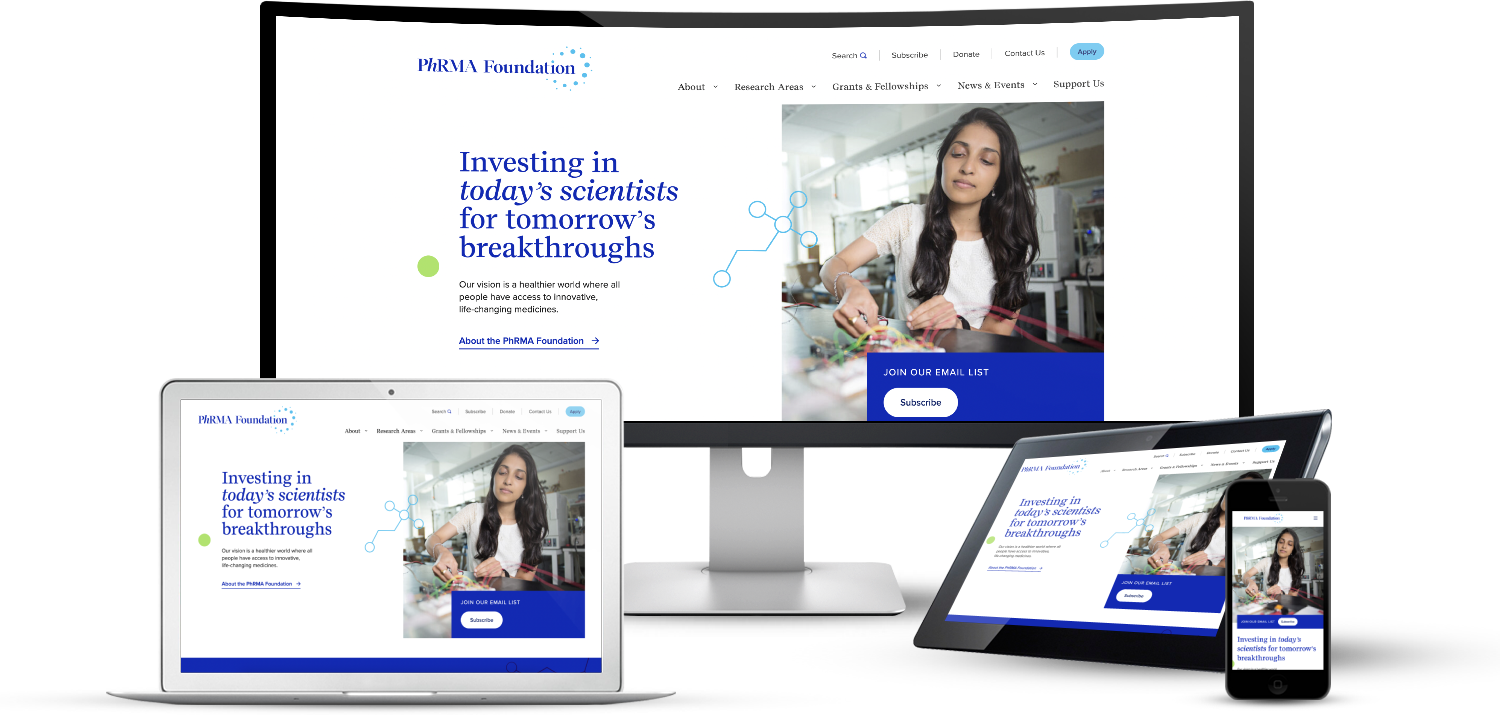
Investing in Today’s Scientists for Tomorrow’s Breakthroughs
Modernizing the PhRMA Foundation’s Digital Experience

Project Overview
Challenges
Our team faced the challenge of unifying stakeholder priorities, simplifying dense information for different user groups, and ensuring accessibility compliance without sacrificing visual appeal. Legacy systems and integration constraints added complexity, making iterative collaboration and careful planning essential.
Defining Milestones
and Deliverables
Several key deliverables were produced to guide the process and ensure a successful outcome. These deliverables represent critical milestones in the project lifecycle, from initial discovery and planning to final implementation and launch. Each item listed below played a crucial role in shaping the PhRMA Foundation website, reflecting our commitment to a thorough, user-centered design approach.

Defining Goals
A critical first step in the PhRMA Foundation website redesign project was establishing clear, measurable goals and objectives.
By defining specific, actionable objectives, we created a roadmap for success and established benchmarks against which to measure the project's outcomes.

Target Audience
Our team facilitated a comprehensive Audience Segmentation Workshop to identify and prioritize the primary, secondary, and tertiary target audiences for the PhRMA Foundation website. This collaborative session provided crucial insights that shaped our user-centric approach to the project.
Defining the target audience allowed us to:
- Tailor content and features to specific user groups
- Optimize the user experience for key stakeholders
- Prioritize design decisions based on audience needs

Defining Key Features and Functionality
A collaborative process was used to determine the most important features and functionalities for the redesigned website.
We discussed how user feedback, stakeholder input, and industry best practices influenced our decisions, and how these choices aligned with the project's overall objectives.

Timeline
By leveraging insights gained from initial discussions, we were able to create a more detailed and actionable roadmap for the website redesign process.
This refined plan not only provided a clear structure for the project's progression but also ensured that all team members and stakeholders had a shared understanding of the project's trajectory and key deliverables.

User & Stakeholder Interviews
By conducting user interviews early in the process, we were able to incorporate valuable user feedback into the website redesign strategy, leading to a more effective and user-friendly final product.

Who We Interviewed
- Two awardees
- A value assessment expert
- A PhRMA Foundation sponsor
- A PhRMA Foundation consultant
Key Findings
- Add success stories and case studies: Showcase the real-world impact of funded research to demonstrate the Foundation's value.
- Highlight the Foundation's history and commitment to science: Create a timeline or dedicated section to illustrate the organization's long-standing dedication to scientific advancement.
- Create video testimonials: Produce engaging visual content featuring awardees discussing their research and the Foundation's impact on their careers.
- Feature examples of winning applications: Provide guidance and inspiration for potential applicants by showcasing successful grant proposals.
- Highlight key differentiators: Clearly communicate what sets the PhRMA Foundation apart from other funding organizations to attract top talent.
- Promote diversity in science: Emphasize initiatives supporting women and minorities in scientific research to foster inclusivity and innovation.
Implementing these strategies significantly enhances the Foundation's visibility, attracts high-quality applicants, and demonstrates its crucial role in advancing scientific research and healthcare policy.
Landscape Analysis
Our landscape analysis focused on three key organizations in the research funding and healthcare policy space.

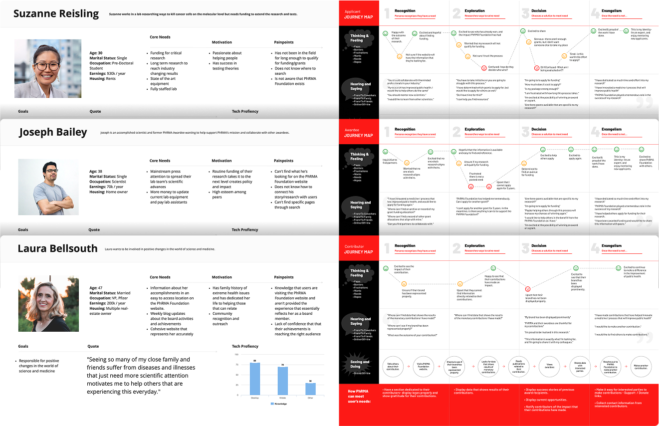
Personas & Journeymaps
Creating these tools provided invaluable insights into the needs, behaviors, and pain points of our target audience, allowing us to create a more user-centric and effective digital experience.
By understanding our users at a deeper level, we were able to tailor the new PhRMA Foundation website to meet their specific needs and expectations.
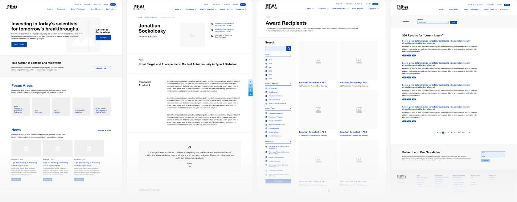
Wireframes
Leveraging the comprehensive insights gathered from our stakeholder interviews, user research, and audience segmentation workshop, we crafted wireframes that served as the blueprint for the PhRMA Foundation's new digital presence.

HiFi Mockups
After wireframes were approved, we transitioned to high-fidelity mockups. Stakeholders reviewed multiple moodboard and logo directions, and their chosen concept informed a cohesive style guide that unified the brand’s visual identity.
Branding by Shannon Callery for Taoti Creative.


Impact
The PhRMA Foundation website redesign earned a 2024 dotCOMM Award, recognizing excellence in digital communication and validating our user-centered, innovative approach to creating an engaging platform that effectively conveys the Foundation’s mission.
- Award Category: Website Redesign
- Recognition Level: Platinum Award Winner
- Year: 2024
This achievement further demonstrates the project's success in meeting both client objectives and industry standards for excellence in digital communication and web design.
Ready to learn more about this project?
Explore the full case study to see a behind-the-scenes look at my research methods, design decisions, and technical solutions.
